All projects · Roche Diabetes Care
CodenameGlucoCheck
Diabetes self-management app
Diabetes self-management you can read in two seconds.
- Client
- Roche Diabetes Care
- Year
- 2013
- Industry
- Health / Diabetes
- Role
- UX-UI · Product
- Partner
- Beta Solutions
- Line
- Accu-Chek, diabetes self-management
- Users
- People with type 1 and insulin-dependent type 2 diabetes, and their care team
- Scope
- Product concept, information architecture, UX and UI
- Platform
- Mobile devices · Microsoft technology
Summary
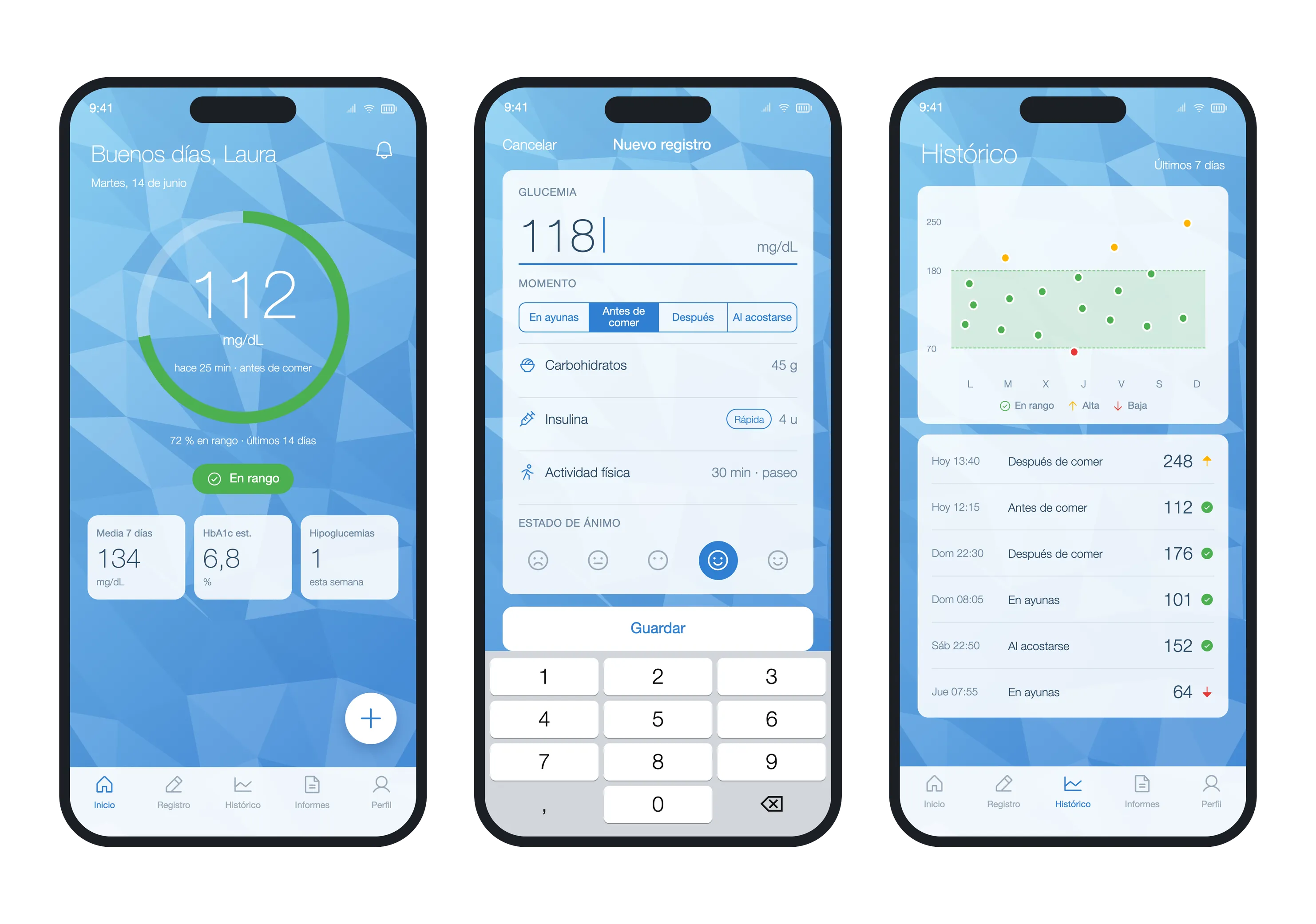
Roche Diabetes Care needed a mobile app for people with diabetes to log their daily routine and share it with their care team. We defined the product concept, information architecture, experience and interface. The backend and the meter firmware were outside our scope.
Screens
Data shown is anonymized.
Splash
Home
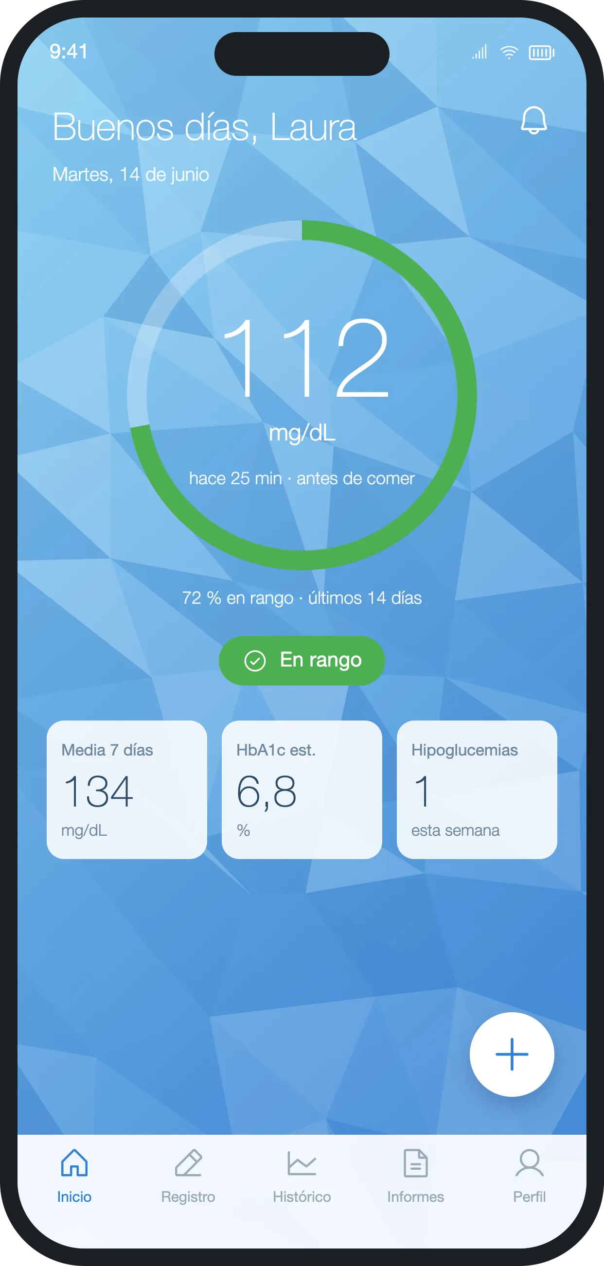
The latest reading and time in range over the last 14 days fit in a single ring.
Home · above target
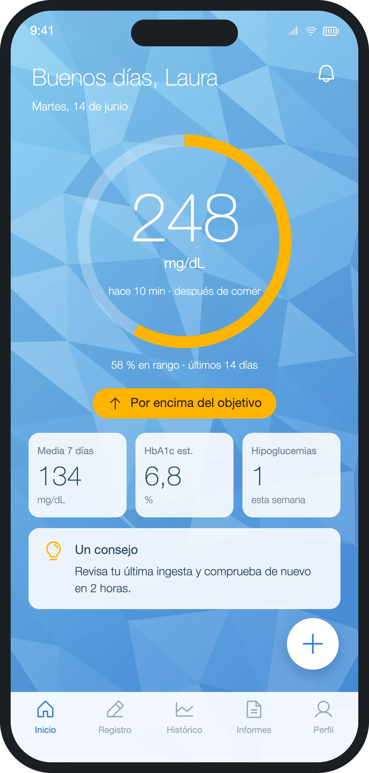
The colour changes with the status, always with an icon, a label and a gentle tip.
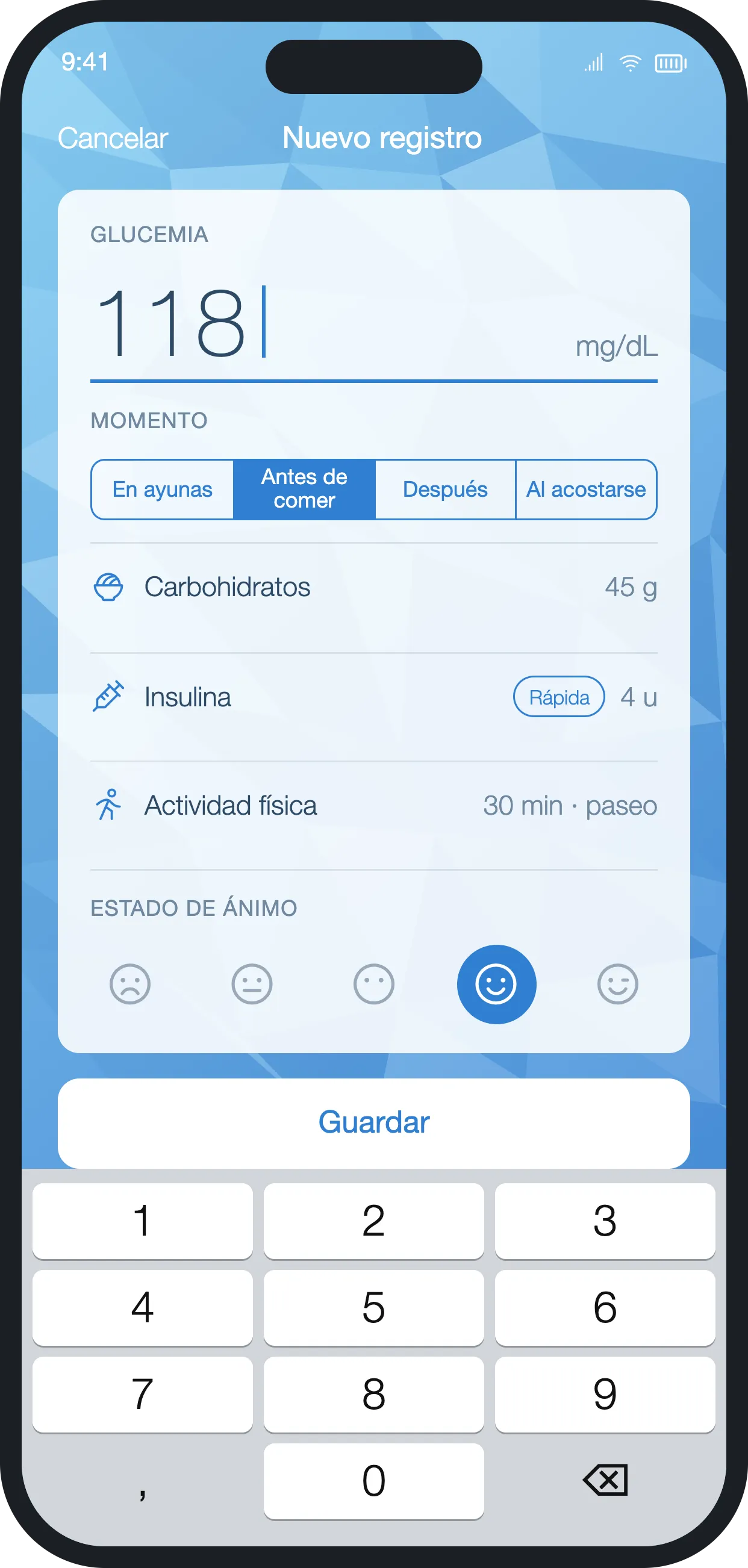
New entry
A complete entry on a single card, with the number pad already open.
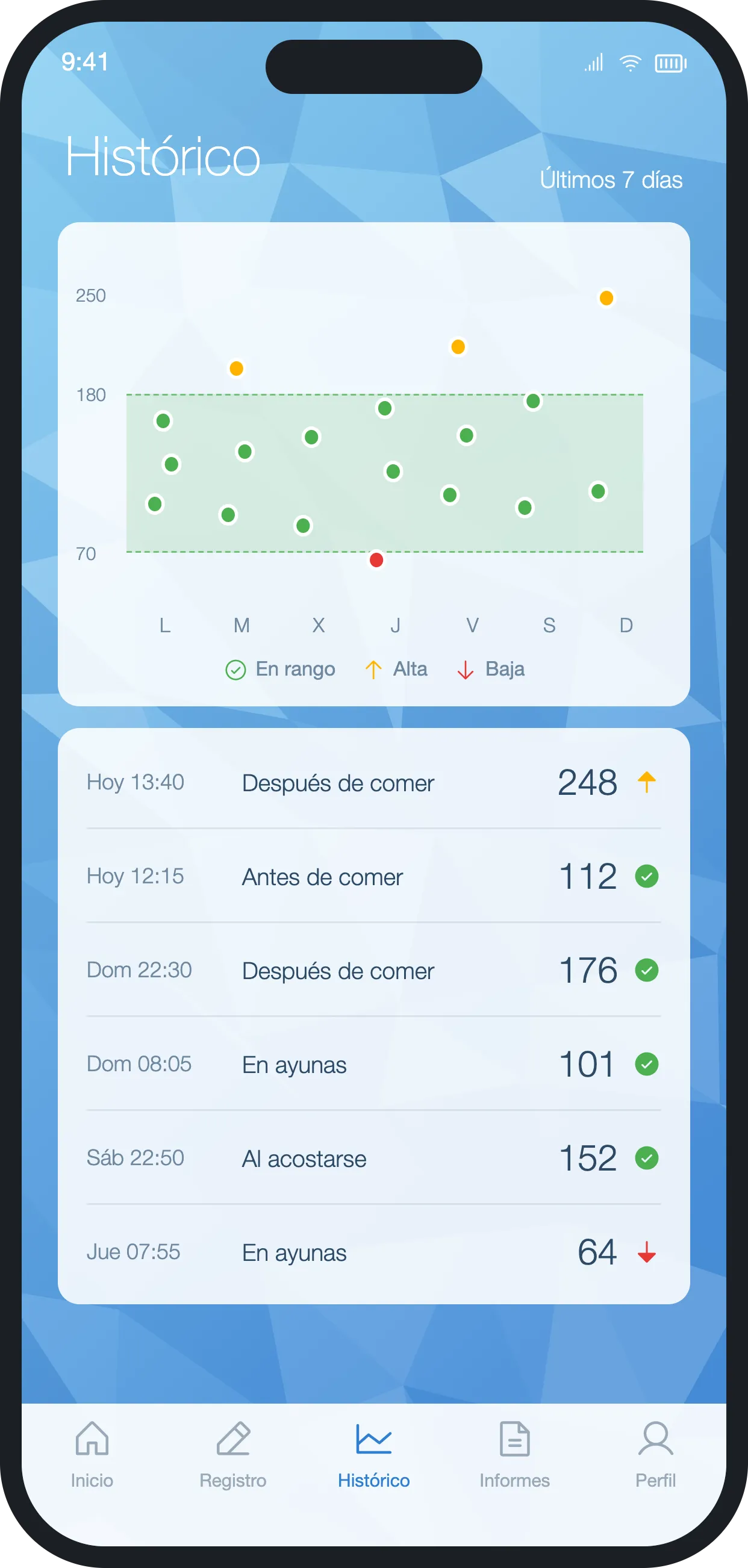
History
Seven days with the 70 to 180 mg/dL target band.
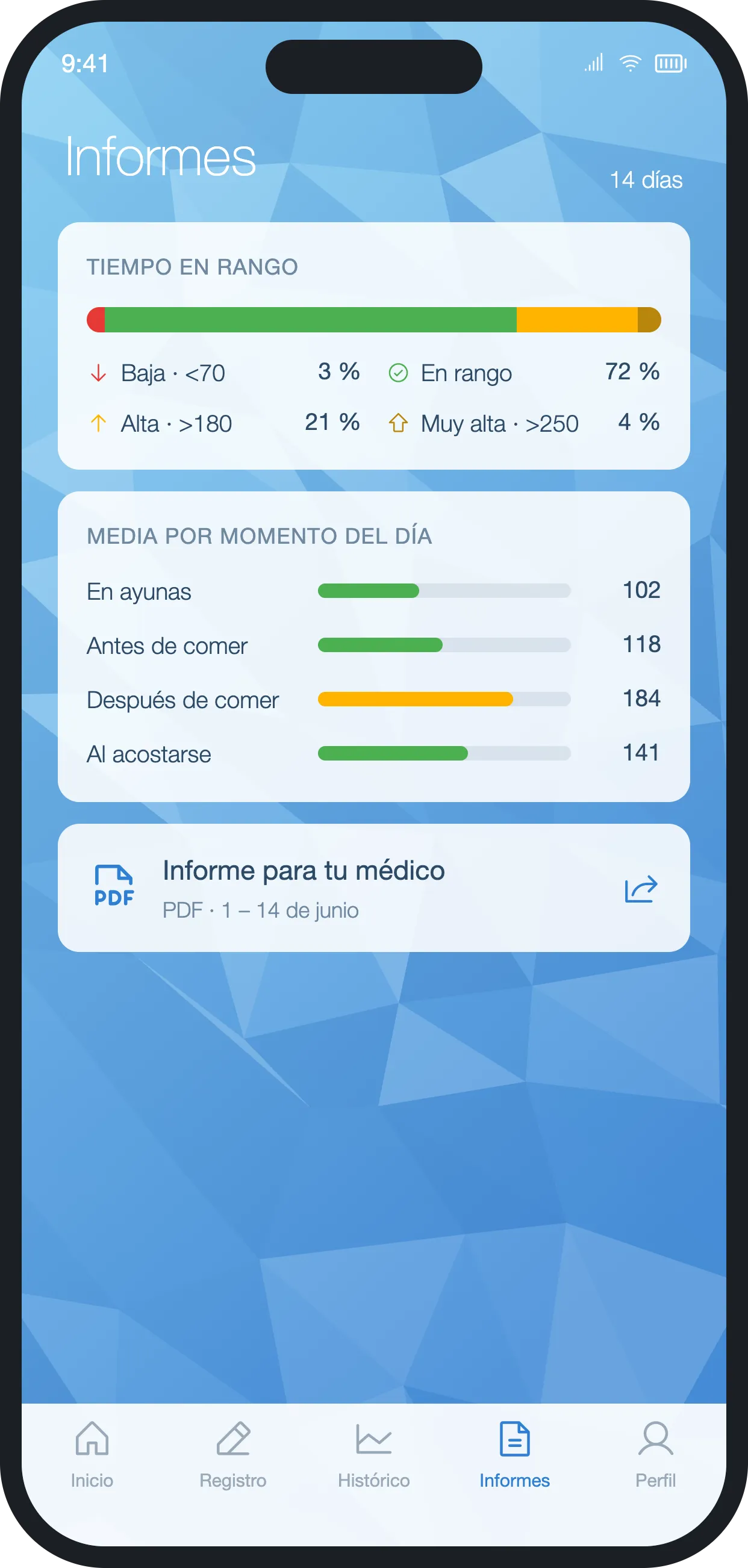
Reports
Time in range and average by time of day, as a PDF for the doctor.
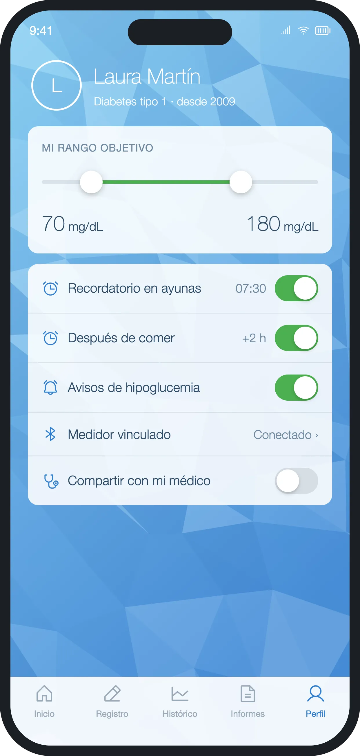
Profile and targets
Target range, reminders and linked meter.
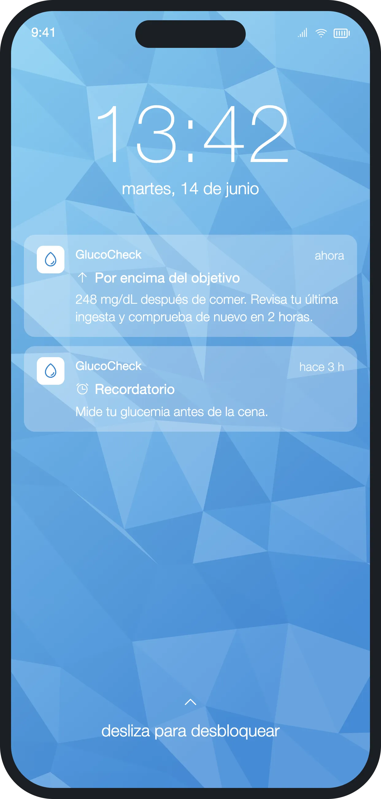
Alerts
Alerts reach the lock screen in the same gentle tone.
The problem
Daily self-management relied on a paper logbook, and that failed at both ends of the patient–doctor relationship.
- Paper logs were incomplete, unreliable and hard to interpret in the consultation.
- Patients could not tell at a glance whether they were doing well.
- Endocrinologists received messy data and lost consultation time sorting it out.
Approach
We designed for something used several times a day, for years. Every screen had to be read in under two seconds, logging a value could take no more than three taps, and the tone had to encourage, never blame. Accessibility was a starting requirement: high contrast, large figures and colour never used on its own, always paired with an icon and text.
What we built
Instant read
The latest glucose reading in mg/dL inside a progress ring showing the share of readings in range over the last 14 days. One glance tells you whether things are going well.
Status traffic light
Green from 70 to 180 mg/dL, amber from 54 to 69 or 181 to 250, red below 54 or above 250. Each state carries its own icon and label, so nobody has to rely on colour.
Logging in under three taps
Glucose, time of day (before or after a meal, at bedtime), carbs, insulin, activity and mood in one short flow.
History and doctor report
Daily and weekly charts with estimated average and estimated HbA1c, plus an exportable report the endocrinologist can read in the consultation as is.
A calming visual language
A sky-blue polygonal background and a deliberately non-clinical look, to ease the anxiety that comes with a condition managed every single day.
Results
We turned a logbook nobody read into a tool patients understand instantly and doctors can use in the consultation.
- Patients know how they are doing without decoding numbers or tables.
- Daily logging takes seconds, which supports consistency.
- Consultations start from organised data instead of an incomplete logbook.
- The accessibility and tone decisions work as well for someone just diagnosed as for someone who has lived with diabetes for years.
Visual system
A faceted sky, thin numerals and a traffic light that always comes with a label.
- Sky#8FD3F4
- Blue#4A90D9
- In range#4CAF50
- High#FFB300
- Low#E53935
- Ink#2C4A66
- 112
Helvetica Neue
Ultra-thin numerals and interface text